Junk Journal
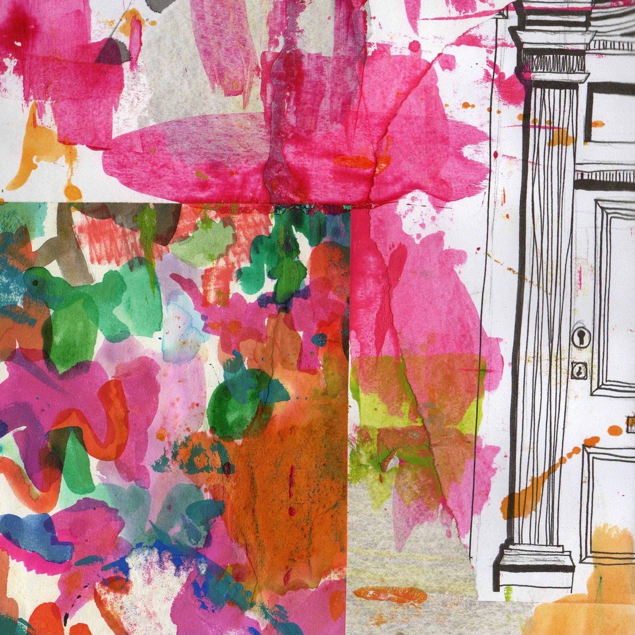
A junk journal was something that I was wanting to do for a long time. I think it was an activity that had the capability to loosen up my drawing style and just experiment and play, which is crucial to this project. The most successful page in this sketchbook is the front page. This is because there is no white space along the background and the entire page is filled with colour, pattern and texture. The layering in this page is successful with layers of inks, paint scrapes, masking fluid and Posca markers.
In some areas of the sketchbook, some colours were not correct, but again, this was when I was experimenting with my colour palette and seeing what colours worked well together. From investigating this throughout the whole sketchbook, I realised that a bright pink, lime green and a cobalt blue worked extremely well together, very similar to the colour palette in my Leman Album sketchbook.
I also realised in this task, that the designs can be rather random with different elements and motifs being included in the drawings. These can include drawings of architectural elements, different pieces of paper you find along the way and images that catch your eye.
If I was to this task again, I would do these style of drawings but in my colour palette that I have now decided in order to make the sketchbook cohesive with everything else.


